Introduction
Getting a hat embroidery right is harder than it looks. The panel is small, curved, and leaves almost no room for error — a logo that's even slightly too wide or nudged off-center will be obvious every single time someone wears the hat.
Two decisions drive the outcome: size and placement. Go too large and the design crowds the panel or bleeds into seams. Too small and it disappears at a normal viewing distance. Neither is a good look for a brand.
This guide covers what you need to know before submitting a file:
- Recommended embroidery dimensions for each major hat type
- Where to position your logo for the result you want
- Technical minimums every designer should know before submitting a file
- What makes a logo stitch out cleanly at small sizes
Key Takeaways
- Front-panel embroidery runs 4" × 1.75" on low-profile caps up to 6.3" × 2.56" on high-profile snapbacks
- Front center is the highest-visibility placement; side and back panels suit secondary or accent branding
- Minimum letter height for readable text: 0.25" — smaller than that, stitches blur together
- Bold, simple logos with thick lines reproduce better on hats than detailed, multi-element artwork
- Hat structure — high vs. low profile, structured vs. unstructured — determines how large your logo can go
Why Size and Placement Matter for Custom Hat Embroidery
A shirt chest gives you several square inches of flat, forgiving fabric. Hat panels don't. According to Impressions Magazine, caps demand precision at every stage because of curved framing, brim interference, and seam registration — there's very little margin to recover from a sizing mistake.
Oversized designs cause real production problems: puckering, distortion, and stitches consumed by seams. On unstructured hats especially, dense or oversize embroidery can pull and gather the fabric, affecting how the hat looks and sits on the head.
Beyond production, sizing and placement affect:
- Logo readability — a design that's too small won't read from across a room
- Overall appearance — a miscentered or crowded design looks unprofessional regardless of thread quality
- Durability — correctly sized embroidery on a properly stabilized hat holds up through repeated wear and washing far better than an oversized design that stresses the fabric
Hat styles vary widely in usable embroidery area — the dimensions below break down what actually fits, by hat type.
Standard Hat Embroidery Sizes by Hat Type
Hat profile — how tall the front panel sits — is the biggest single factor in how large a design can be. But seam placement, fabric construction, and backing also matter. Use the table below as a working reference, then confirm exact limits with your embroidery shop before production.
| Hat Style | Front Panel Max | Side/Back Max |
|---|---|---|
| High-profile snapbacks & truckers | ~6.3" × 2.56" | ~2" × 1" |
| Low-profile baseball caps & dad hats | ~4" × 1.75" | ~2" × 1" |
| Beanies / knit hats | ~5" × 1.75" | — |
| Bucket hats | ~5" × 2" | — |
| Visors | ~4" × 1" | — |
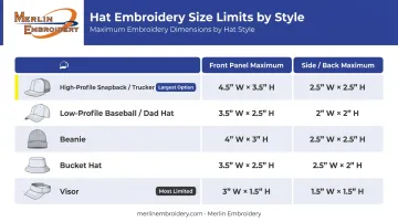
Dimensions reference Printful's 2024 production specifications. OTTO CAP and Richardson publish different limits by blank and program — treat these as directional benchmarks, not universal rules.
Snapbacks and Trucker Hats (High-Profile)
High-profile hats have a taller, structured front panel — typically 4"+ in crown height — which gives the most usable embroidery space. Designs up to approximately 6.3" wide × 2.56" tall fit comfortably on the front. The stiff, flat panel also handles more complex or layered designs without distortion, making them the most reliable surface for detailed logos or large wordmarks.
Side and back placements on high-profile hats stay compact, generally around 2" × 1".
Baseball Caps and Dad Hats (Low-Profile)
Where high-profile hats give you room to work with, low-profile and unstructured caps sit closer to the head with a shallower front panel. The usable front area drops to roughly 4" wide × 1.75" tall. On soft, unstructured fabric, larger or more intricate designs increase the risk of puckering — the fabric flexes during wear and doesn't hold dense stitching the way a structured front does.
Simpler, bolder logos work best here. Think clean wordmarks or single-color icons rather than multi-layer artwork.
Beanies, Bucket Hats, and Visors
Each has its own constraints:
- Beanies: Front area of approximately 5" × 1.75". Fabric stretch means simpler, horizontal designs hold better
- Bucket hats: Slightly more room at roughly 5" × 2", with a flatter panel than a structured cap
- Visors: The most limited option at around 4" × 1" due to the crownless structure — bold and horizontal is the only workable approach here
Hat Logo Placement Guide: Front, Side, and Back
Placement should follow purpose:
- Front center — primary logos, team marks, and main wordmarks
- Side panels — initials, secondary icons, and minimalist accents
- Back — URLs, slogans, or "Est." dates
Front Center Placement
Front center is the most visible placement on any hat — it's where the eye goes first. Use it for your main logo, team mark, or primary wordmark.
Center the design horizontally and keep it within 2"–4" wide as a general rule. Pushing to the panel edges looks crowded even when dimensions technically fit — margin space on both sides gives the design room to breathe and produces a cleaner result.
Side Placement
Side logos should stay compact — generally 2" wide × 1" tall or smaller. Best uses include:
- Initials or monograms
- Small secondary brand icons
- Minimalist accent marks
Flat embroidery only — the curved, narrower surface of a side panel isn't suited for 3D puff. Position the design between the panel seams, roughly centered on the side.
Back Placement
Back placement is ideal for short supporting text: a website, slogan, or "Est." date. Keep it within roughly 2.5"–3.5" wide and up to 1.25" tall — though some blank manufacturers allow slightly wider areas, so check with your shop.
Arched text that follows the curve of the hat opening tends to look more intentional than straight text at the back, which can appear flat or disconnected from the hat's shape.
Combining placements is a practical option for corporate and team orders: a primary logo on the front, initials or a small icon on the side. Keep the side element noticeably smaller than the front logo so the hierarchy reads clearly at a glance.
Technical Constraints Every Designer Should Know
These are the limits that determine whether a design is actually producible, not just visually appealing on screen.
Text and Line Minimums
- Minimum letter height: 0.25" (6.35mm) for lowercase; some providers specify 0.3" for uppercase. Below this threshold, letters merge and lose definition after stitching
- Minimum line/stroke thickness: 0.05" (approximately 4pt). Thinner strokes break apart in thread and won't hold their shape
Flat vs. 3D Puff Embroidery
| Flat Embroidery | 3D Puff Embroidery | |
|---|---|---|
| Method | Stitched directly on fabric surface | Foam underlay added beneath stitches |
| Best for | Detailed logos, text, smaller designs | Bold shapes, large letters |
| Panel placement | Front, side, back | Front panels only (side panels: flat only) |
| Design complexity | Works with more detail | Requires simple, thick shapes |
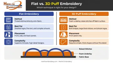
3D puff uses physical foam — typically 2–4mm thick — beneath the stitches to raise the design off the surface. Fine detail and small text won't translate well with this method.
Thread Colors
Standard embroidery designs are often limited to 6 thread colors per design depending on the provider — though many commercial machines support 8–10 needles. Highly detailed, multi-color logos frequently need simplification before they can be produced cleanly. Confirm your shop's color limit before finalizing artwork.
Structured vs. Unstructured Hats
Structured hats hold their shape during embroidery, keeping the design flat and consistent. Unstructured caps flex — both during the embroidery process and through regular wear — meaning dense or oversized designs are more likely to pucker or shift. That's why sizing down matters more on softer hats than on structured ones.
Design Tips for Embroidery-Friendly Hat Logos
Simplify Before You Submit
Logos built for screens often include gradients, thin decorative lines, and small ornamental details. These don't transfer to thread reliably. Impressions Magazine advises using thicker lines, avoiding fine detail, and choosing simple block text for cap designs.
For hat embroidery, create a simplified version of your logo that keeps the core mark, drops ornamental elements, and bumps up line weight. That version will stitch cleanly where the original won't.
Think About Shape, Not Just Size
Circular or square logos visually occupy more panel space than a horizontally oriented logo at the same stated width. Since embroidery areas are always wider than they are tall, horizontal logos tend to fit the available space more efficiently.
If your logo is circular, scale it so the height stays within the panel limit — not just the width.
Work With Your Embroidery Shop Early
The most reliable way to avoid sizing mistakes is to get a design review before production begins. At Merlin Embroidery, the team has spent over 30 years helping clients work through logo sizing, file preparation, and hat selection before a single stitch is made. That pre-production conversation consistently prevents the most common and costly errors.
Frequently Asked Questions
What size should a hat embroidery design be?
For most hats, front-panel embroidery falls between 4"–5" wide × 1.75"–2.56" tall. High-profile snapbacks allow the larger end of that range; low-profile dad hats sit at the lower end. Your exact maximum depends on the specific hat style and structure.
What is the recommended logo size for the front of a baseball cap?
A standard low-profile baseball cap accommodates designs up to approximately 4" × 1.75". High-profile structured caps can go larger, up to around 6.3" × 2.56". When in doubt, size down slightly rather than risk crowding the panel.
Can you embroider on the side and back of a hat?
Yes. Side logos typically stay within 2" × 1", and back placements max out around 2.5"–3.5" wide. Only flat embroidery is appropriate for side and back panels — 3D puff is reserved for front panels.
What is the minimum font size for embroidered text on a hat?
The minimum recommended letter height is 0.25" (6.35mm). Below that, letters lose definition during stitching and tend to blur together further after washing. For uppercase characters, 0.3" is a safer floor.
What is the difference between flat and 3D puff embroidery on hats?
Flat embroidery lies flush with the fabric and suits most logos, including detailed artwork and text. 3D puff uses a foam underlay to raise the design off the surface, making it ideal for bold, simple shapes — but only on front panels of structured hats.