How To Choose The Right Thread Colors For Your Embroidered Logo
Have you ever found yourself staring at a color palette, hopelessly trying to decide which hues best represent your brand for that perfect embroidered logo? Choosing the right thread colors for your embroidered logo is more complex than picking your favorite shades. There’s a whole science and art behind it. Let’s break it down so you can make an informed and confident decision.
Choosing The Right Thread Colors For Your Embroidered Logo
Deciding on the right thread colors for your embroidered logo can be as crucial as the logo design itself. The colors you choose can significantly impact how your brand is perceived. This guide will help you navigate the colorful landscape of thread selection, providing you with actionable insights to ensure your logo stands out in the best possible way.
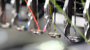
![]()
This image is property of images.unsplash.com.
Understanding Your Brand Colors
What Do Your Brand Colors Say About You?
Colors are more than just visual stimuli; they evoke emotions and convey messages. Each color has its own psychological impact. For instance:
| Color | Emotion/Meaning |
|---|---|
| Red | Passion, energy, attention |
| Blue | Trust, professionalism, calm |
| Yellow | Optimism, happiness, warmth |
| Green | Growth, health, tranquility |
| Black | Sophistication, power, elegance |
| White | Purity, simplicity, cleanliness |
When choosing thread colors, consider what your brand colors are saying about you. This is the foundation of your decision-making process.
Company Palette Vs. Embroidery Thread
You might have an established company color palette, which is a great start. However, remember that the same colors might look different when translated into thread. Threads come in various finishes such as matte, satin, or metallic, each affecting how the color appears under different lighting conditions.
Matching Threads With Your Logo
Simplification May Be Necessary
Your logo might be intricate and colorful on a digital screen, but when it comes to embroidery, less may be more. Threads can only be so precise, and too many colors might make your logo look cluttered. Simplifying your design can help retain its integrity in the embroidered form.
Spot Vs. Blended Colors
Some logos use blended colors that flow seamlessly into one another. While this looks great digitally, it’s a challenge for embroidery. Opting for clear, spot colors can result in a cleaner and more recognizable logo.
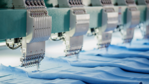
![]()
This image is property of images.unsplash.com.
Considering Fabric and Thread Interaction
Fabric Color and Texture
The fabric on which your logo will be embroidered plays a crucial role. Dark fabrics might require brighter threads for visibility, while lighter fabrics can accommodate darker threads. Different fabrics also interact differently with threads:
| Fabric Type | Thread Interaction |
|---|---|
| Cotton | Absorbs color well, less shine |
| Satin | Reflects light, more shine |
| Denim | Requires thicker threads |
| Wool | Adds texture, absorbs light |
Thread Weight and Texture
Thread comes in different weights and textures. Finer threads work well for detailed designs, while thicker threads add boldness. Depending on your logo and fabric, the weight and texture of the thread can dramatically affect the final look.
Testing and Sampling
Always Request Samples
Before committing to your final colors, request thread samples. This lets you see exactly how the colors look once embroidered. Just because a thread looks right on the spool doesn’t mean it will look the same on your chosen fabric.
Conducting Patch Tests
A patch test involves embroidering your logo on a sample piece of fabric. This test helps you see the interaction of thread and fabric and make necessary adjustments before full production. It’s better to fix any issues at this stage than after you’ve produced hundreds of embroidered pieces.
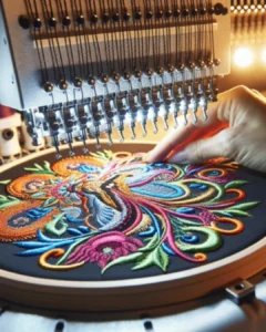
![]()
This image is property of images.unsplash.com.
Practical Tips for Choosing Colors
Start With a Dominant Color
Begin with the primary color dominating your logo and build your palette from there. This approach aligns the embroidered version closely with your digital logo.
Balance and Contrast
Pay attention to color balance and contrast. A well-balanced logo uses colors that complement each other. You don’t want sections of your logo getting lost due to poor color contrast.
Use Color Theory
Understanding basic color theory can be beneficial. Here’s a quick primer:
- Complementary Colors: Colors opposite each other on the color wheel (e.g., blue and orange) create a vibrant look but should be used in moderation.
- Analogous Colors: Colors next to each other on the color wheel (e.g., blue, blue-green, and green) create a harmonious look.
- Triadic Colors: Three evenly spaced colors on the color wheel (e.g., red, blue, yellow) offer a bold and balanced palette.
Testing With Light
Different lighting can change how the thread colors appear. Test your embroidered sample under various lighting conditions to ensure it stays true to your brand regardless of the environment.
Common Mistakes to Avoid
Over-Complicating the Design
Detailed designs with too many colors can turn out poorly when embroidered. Stick to simpler configurations to maintain the logo’s clarity.
Ignoring Fabric Type
Not all threads work well on all fabrics. Ignoring this can lead to poor embroidery quality. Always match the thread type with your fabric.
Skipping the Sampling Stage
Rushing into production without trial samples often leads to subpar outcomes. Always test your logo on fabric to make necessary tweaks.
![]()
Tools and Resources for Color Selection
Digital Tools
Use digital tools like Adobe Illustrator or design software with a Pantone color matching feature to visualize your logo in different thread colors.
Color Matching Systems
Pantone offers books specifically for textiles and threads. These can serve as a helpful guide when selecting the perfect thread color.
Professional Help
Sometimes it’s best to consult with professionals who specialize in embroidery. They can offer expert advice and practical solutions for any challenges you might face.
Making the Final Decision
Review and Reflect
Take the time to review your options. Gather feedback from colleagues or a focus group. Sometimes a fresh set of eyes can catch something you missed.
Trust Your Instincts
While data and samples are essential, don’t underestimate your gut feeling. If a particular color combination feels right, it probably is.
![]()
Conclusion
Choosing the right thread colors for your embroidered logo is an art and a science. It requires understanding your brand, considering the interaction between fabric and thread, and conducting thorough testing. Follow these guidelines, and you’ll have a visually appealing embroidered logo that effectively represents your brand. Remember, the right colors can make all the difference in creating a memorable and impactful logo.
Armed with this knowledge, you’re now ready to make an informed decision. Good luck with your embroidery!